Looking Back on History with the Richmond Olympic Experience Timeline …
The Olympic Sporting History timeline is perhaps the most visually iconic interactive exhibit at Richmond Olympic Experience (ROX). Spanning over 32’ in length across eight 55″ multitouch tables, it is the centrepiece of the core ROX experience. Arranged as a chronological timeline—from the beginning of the modern Olympics to the present—visitors delve into the rich history of Olympic and Paralympic athletes from both the Winter and Summer Games.

While the design challenges were many, a few of the requirements were real head-scratchers. First, given that the table was to be an ‘island’ that could be accessed from either side simultaneously, the interface needed to have a neutral orientation—that is, no top or bottom or upside-down or right-side-up. Another obstacle was the vast amount of content—there were 160+ Olympic ‘stories’, each containing several layers of text, images and video. The client brief required that desired content needed to be found quickly and intuitively. How would we deliver so much content without turning the exhibit into a ‘digital library’?
From the onset, one of EDM’s steadfast goals was to avoid creating a ‘multitouch playground’ full of unnecessary effects that we felt would do a disservice to the content. We were intent on creating something extraordinary, but it was not the place for the ubiquitous ‘pinch to zoom and rotate’ that we’ve all seen on multitouch tables. We set to work exploring several different interface paradigms. After a few weeks of wireframing and carrying out rough functional alpha builds, there were three candidates that seemed to have legs. ‘Rings’ was inspired by the familiar Olympic rings and would be effective in achieving neutral orientation. From the main screen, visitors could rotate the rings to their orientation then choose their story. ‘Snowflake’ was a more loose and ethereal approach where stories are accessed on tiles that gently drift around the interface occasionally rotating 180 degrees. Lastly, ‘Accordion’ would nest the Olympic stories into columns that could expand and contract like the folds of an accordion’s bellows.


All three approaches had their merits but after considerable testing, we determined that Accordion was the best approach. It combined a pleasing and intuitive content-friendly user interface with plenty of ‘wow’.
But we had not quite figured out how to make it work for multiple users on the same table at opposite sides (with no help from motion sensors). The first and most obvious solution was to notionally divide the tables across the vertical centre. The content on the bottom half of the screen would be for you, and would be mirrored on the top half for someone across from you. The results were totally underwhelming. We were permanently sacrificing half of each table for a part-time scenario and it just didn’t feel right. Next we tried to create a ‘circuit’ around the perimeter of the tables—wrapping the years so that the content was not mirrored, but rather formed a ‘walking loop’ that could be travelled. It was nice in theory, but unfortunately, this meant that only half of the content was accessible from each side of the table.

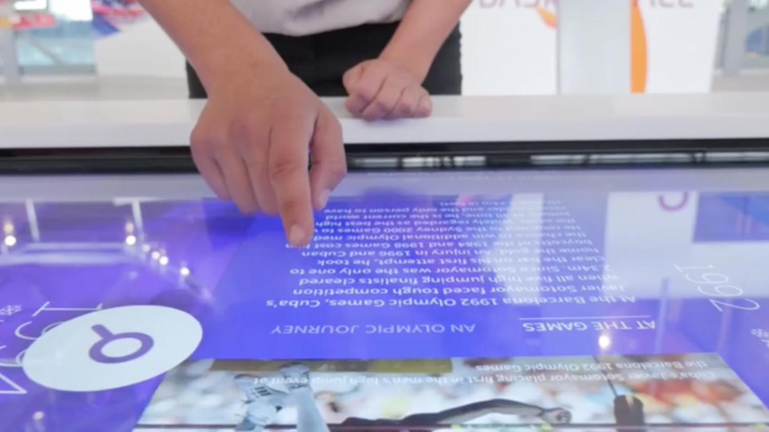
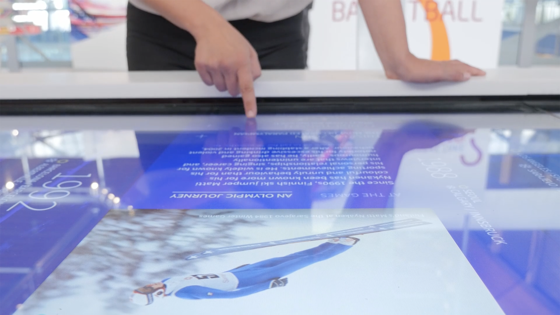
Of course, the real solution was much simpler than anything else we had tried. And the mechanics would be totally invisible to the visitor. No splitting the screen or need for the visitor to manually rotate content. Because of the sheer size of each screen, we realized that the vast majority of visitors would naturally touch the lower half of the screen to get started. By tracking whether initial touches occur at the top or bottom of a screen, the program would deliver the content to the correct orientation. So if a touch was registered in the lower half, content would be oriented to the bottom of the screen. If the touch was registered in the top half of the screen it would be sent ‘upside-down’ to the top half. We augmented this by adding some subtle, orientation-specific prompts to each side of the table, and the results have been amazing. It worked!
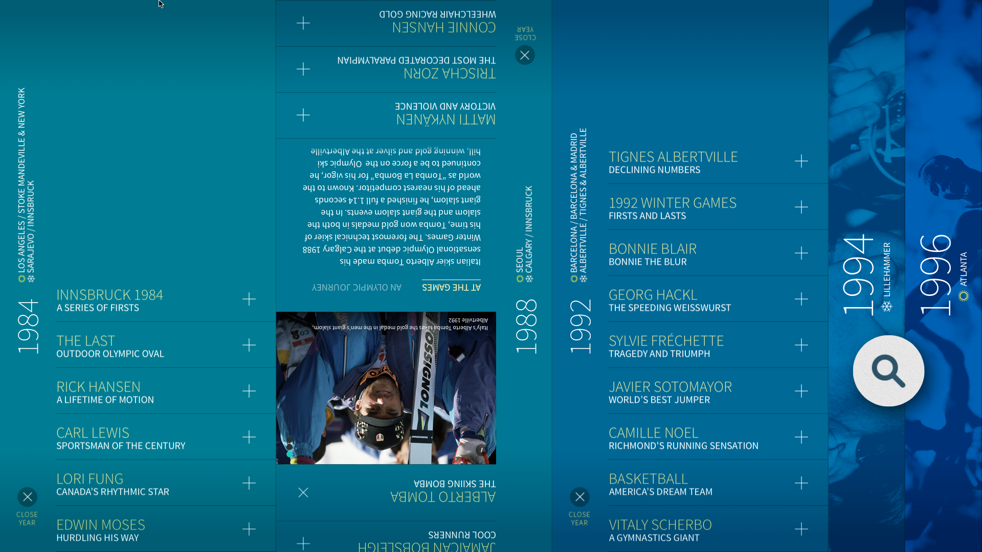
Next, we needed to deliver on the promise to make finding specific content easy. With so many stories on display, the client envisioned being able to reach in and quickly pull out Richmond Olympic athlete stories or to be able to hone in on a particular country, athlete or event. We toyed with the idea of adding a small ‘dock’ to the top and bottom of each table with a search field, but it only served to frame the interface making it feel constrained and less expansive. Our programmer Orestis floated the idea of a roving ‘puck’ that contained a nested list of topics that would be generated by tags in the exhibit’s content management system. We tried it out and realized that it not only provided the search functionality, but also checked off two other client requests: 1) that there be something kinetic and ‘fun’, and 2) that there be some interplay between tables. The ‘fun’ is pretty obvious…we’ve observed many visitors flicking the puck around the table. To avoid the aforementioned ‘multitouch playground’ though, Orestis added just enough physics and friction to keep air hockey games from breaking out! When a visitor selects a topic from the puck’s menu, a ‘badge’ appears and slowly glides to it’s destination, where it automatically opens the requested story. Visitors are delighted as their badge leaves the edge of one screen and appears uninterrupted on the next. We now had our interplay between tables!
 The search puck gently floats around the screen
 Touching the puck opens 3 content categories
 Content is nested in sub-categories
 The desired content is selected
 A ‘badge’ pops from the search drawer and falls to the bottom of the screen
 The ‘badge’ slowly moves to the year wherein the content resides


Olympic Sporting History exhibit at ROX was definitely one of the more challenging exhibits that EDM has developed to-date. But in the end, these are exactly the type of challenges we thrive on. The exhibit has been up-and-running problem free since November 2015, and it’s been so rewarding to see visitors crowded around (both sides of) the table!
Care to share your thoughts? Please contact us using the form below or send us an email.